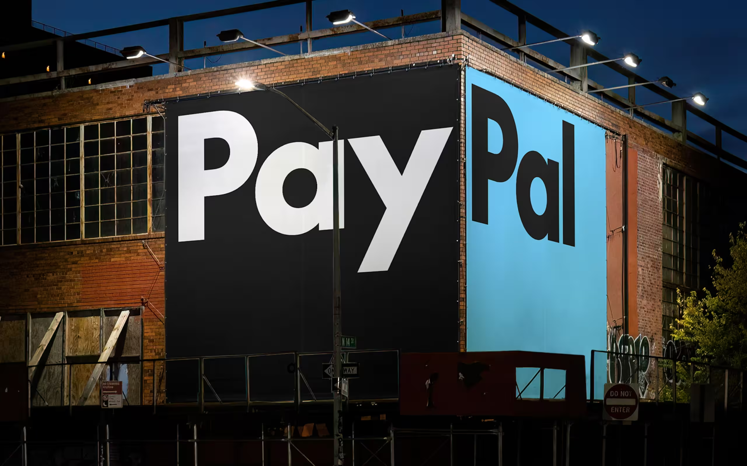
Recently, PayPal unveiled a transformative brand refresh in partnership with Pentagram. The shift from their iconic blue to a striking black wordmark, coupled with a redesigned logo and bespoke typeface, marks a new era of sophistication and modernity for the brand. But beyond its visual appeal, there are powerful takeaways for startups, VCs, and entertainment brands that aspire to make their mark. Here’s what PayPal did right—and how you can use these strategies to elevate your own brand identity.
1. Redefining the Color Palette: Reinvention Without Losing Identity
PayPal’s move from its signature blue to a confident black wordmark is a textbook case of strategic rebranding. The new color palette includes whites and various shades of blue, differentiating PayPal from other fintech players while maintaining a sense of familiarity.
Startups and entertainment companies can gain an edge by analyzing the visual landscape of their industry. Is everyone relying on the same color schemes? Breaking the pattern can instantly elevate your brand presence and set you apart as an innovator.
2. Custom Typography: Defining Brand Personality Through Typeface
PayPal’s new wordmark, created using the proprietary “PayPal Pro” typeface, blends modern aesthetics with timeless elegance. It’s derived from the iconic Futura, adding readability and a distinctive voice.
For startups and VCs, typography is more than aesthetics—it’s a way to communicate professionalism and trustworthiness. The right typeface can make even complex content approachable, providing an edge when pitching to investors or communicating with clients.
3. Logo Flexibility: Building a Multi-Context Brand Identity

The updated PayPal monogram—interlocking “P”s—now stands confidently or paired with the wordmark. This modular approach enhances PayPal’s adaptability across different platforms and mediums, from small-scale digital icons to large-format prints.
logo flexibility is key if your brand has multiple facets—like a VC firm that manages several funds or an entertainment brand branching into new formats. A modular logo system allows your brand marks to work independently yet cohesively to tell a unified story.
4. Motion Graphics: Enhancing Brand Interactivity
PayPal’s refreshed brand isn’t static. Their new motion language—rooted in everyday digital interactions like tapping and swiping—breathes life into the brand. It makes the visual experience more immersive, conveying the ease and speed of PayPal’s services.
Motion is no longer a “nice-to-have” for brands in the entertainment and digital spaces. It’s a must. Small animations can highlight key features of your product, draw attention to calls to action, or simply make your website feel more dynamic.
5. Strategic Alignment: A Brand That Reflects Your Vision
Beyond aesthetics, PayPal’s refresh aligns with its broader mission: simplifying global financial transactions. This holistic approach is crucial for any business looking to refresh its identity. It’s not about jumping on the latest design trend—it’s about communicating your values and vision.
A rebrand should never be a cosmetic change. For startups, this is your chance to redefine who you are and what you stand for as you grow. For VCs, it’s a strategic move that can position your portfolio companies as leaders in their fields. Meanwhile, Entertainment brands can use rebranding to reflect shifts in audience preferences or content direction.
Brand with a Purposeful Refresh
PayPal’s rebrand is a lesson in balancing innovation with consistency. They’ve maintained their essence while pushing the envelope—something every ambitious brand can aspire to. If you’re a startup, VC, or entertainment brand looking to redefine your visual identity, now is the time to make strategic choices that resonate with your audience.
Feeling like your brand’s getting lost in the noise? Let’s break through together. Book your free consultation now!


